1. position : 요소의 위치 정의
1-1. position의 속성 값
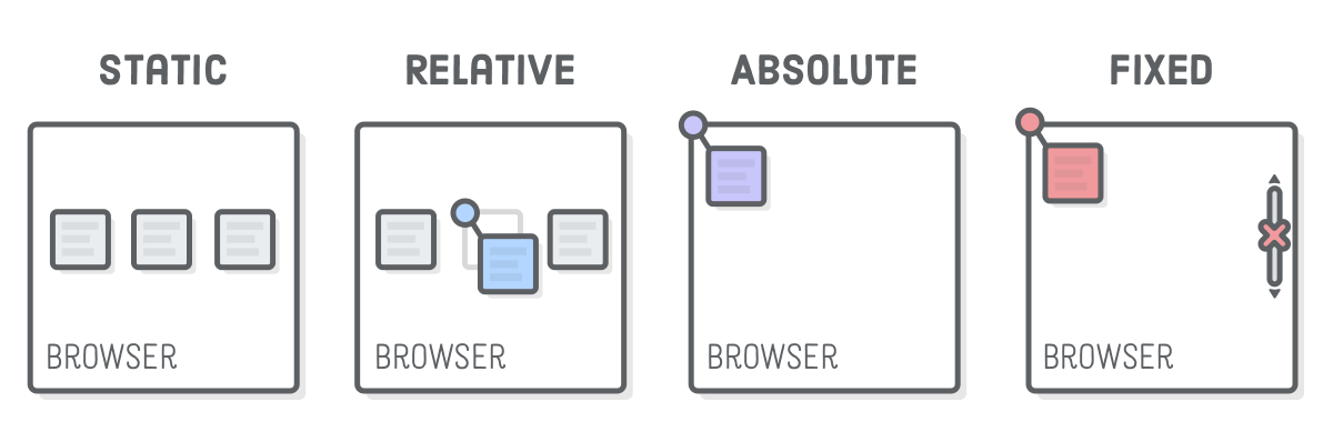
| 속성 값 | 설명 |
| static (기본위치) |
- 요소를 이동하거나 겹칠 수 없는 원래 그대로의 상태 - relative, absolute, fixed 했던 박스를 원상태로 회복 |
| relative (상대위치) |
- left, top 송성으로 이동을 할 수 있음 - position: absolute로 지정된 요소의 '부모 요소' 역할을 할 수도 있음 |
| absolute (절대위치) |
- 원래 위치에서 따로 떼어내 독립적으로 새로운 위치를 설정 - left, right, top, bottom 속성으로 위치를 지정할 수 있음 - 부모 박스를 기준으로 위치를 지정함 (relative 부모가 없을 시에는 body가 부모가 된다) |
| fixed (고정위치) |
- 요소의 위치를 screen 기준으로 지정함 - left, right, top, bottom 속성으로 위치를 지정할 수 있음 |
1-2. left, right, top, bottom
| 속성 값 | 설명 |
| left: 100px; | 요소를 부모 박스의 좌측에서 우측 방향으로 100px 떨어진 곳에 배치 |
| right: 10px | 요소를 부모 박스의 우측에서 좌측 방향으로 10px 떨어진 곳에 배치 |
| top: 150px; | 요소를 부모 박스의 상단에서 아래로 150px 떨어진 곳에 배치 |
| bottom: 100px; | 요소를 부모 박스의 바닥에서 위로 100px 떨어진 곳에 배치 |
| left: auto; | left 값을 취소함 |
| right: auto; | right 값을 취소함 |
| top: auto; | top 값을 취소함 |
| bottom: auto; | bottom 값을 취소함 |
[ position: static; / position: relative; ]
<!DOCTYPE html>
<html lang="en">
<head>
    <meta charset="UTF-8">
    <title>position</title>
    <style>
        .parent{ width: 150px; height: 150px;
        	margin: 0 30px; display: inline-block;
            background: gray; border: 1px solid red;
        }
        .static-box{ text-align: center; line-height: 150px;
            color: #fff; font-weight: bold; background: navy;
            position: static;
        }
        .relative-box{ text-align: center; line-height: 150px;
            color: #fff; font-weight: bold; background: purple;
            position: relative; top: 50px; left: 50px;
        }
    </style>
</head>
<body>
    <div class="parent">
        <div class="static-box">static-box</div>

    </div>
    <div class="parent">
        <div class="relative-box">relative-box</div>
    </div>
</body>
</html>static-box
relative-box
[ position: absolute; ]
<!DOCTYPE html>
<html lang="en">
<head>
    <meta charset="UTF-8">
    <title>position: absolute</title>
    <style>
        .parents{ width: 200px; height: 200px; display: inline-block;
            background: gray; border: 1px solid red; margin: 50px 0 0 300px;
            position: relative;
        }
        .absolute-box{ width: 200px; height: 200px;
            text-align: center; line-height: 200px;
            color: #fff; font-weight: bold; background: darkgreen;
            position: absolute; top: 50px; left: 50px;
        }
    </style>
</head>
<body>
    <div class="parents">
        <div class="absolute-box">absolute-box (in parents) </div>
    </div>
    <div class="absolute-box">absolute-box (no parents) </div>
</body>
</html>absolute-box (in parents)
absolute-box (no parents)
[ position: fixed; ]
<!DOCTYPE html>
<html lang="en">
<head>
    <meta charset="UTF-8">
    <title>position: fixed</title>
    <style>
        .fixed-box{ position: fixed;
            color: #fff; font-weight: bold; text-align: center;
            background: dimgray;
        }
        .sidebar{ width: 80px; height: 100%; padding-top: 100px;
            top: 0; right: 0;
        }
        .footer{ width: 100%; height: 50px; line-height: 50px;
            bottom: 0; left: 0;
        }
    </style>
</head>
<body>
    <div class="fixed-box sidebar">fixed-box (sidebar)</div>
    <div class="fixed-box footer">fixed-box (footer)</div>
</body>
</html>
2. z-index : 겹쳐 있는 요소들의 계층을 변경할 때 사용 (순서 정하기)
<!DOCTYPE html>
<html lang="en">
<head>
    <meta charset="UTF-8">
    <title>z-index</title>
    <style>
        .nomal-box{ width: 100px; height: 100px;
            font-size: 13px; text-align: start;
        }
        .ab-box{ width: 100px; height: 100px;
            font-size: 13px; text-align: center;
            position: absolute;
        }
        .pink{background: pink;
            z-index: 1000; /* static 요소에는 z-index 적용 안됨*/
        }
        .yellow{background: yellow;
            z-index: 100;
            left: 50px; top: 60px;
        }
        .skyblue{background: skyblue;
            text-align: end; box-sizing: border-box; /* 글자가 보이기 위해 조정 */
            z-index: 10;
            left: 140px; top: 80px;
        }
        .coral{background: coral;
            z-index: 1;
            left: 90px; top: 20px;
        }
    </style>
</head>
<body>
    <div class="nomal-box pink">nomal-box / <br>z-index: 1000</div>
    <div class="ab-box yellow">absolute-box / z-index: 100</div>
    <div class="ab-box skyblue">absolute-box / z-index: 10</div>
    <div class="ab-box coral">absolute-box / z-index: 1</div>
</body>
</html>nomal-box /
z-index: 1000
z-index: 1000
absolute-box / z-index: 100
absolute-box / z-index: 10
absolute-box / z-index: 1
3. overflow : 자식 요소가 부모 요소의 영역를 벗어났을 때 처리 방법을 정의
| 속성 값 | 설명 |
| visible | 영역을 벗어난 부분을 그대로 표시한다. (기본값) |
| hidden | 영역을 벗어난 부분을 보이지 않게 한다. |
| scroll | 영역을 벗어난 부분이 없어도 스크롤을 표시한다. (현재 대부분 브라우저는 auto와 동일하게 작동한다.) |
| auto | 영역을 벗어난 부분이 있을 떄만 스크롤을 표시한다. |
<!DOCTYPE html>
<html lang="en">
<head>
    <meta charset="UTF-8">
    <title>overflow</title>
    <style>
        .over{ width: 150px; height: 150px; padding: 10px; margin:20px;
            font-size: 16px; border: 1px dotted gray; border-radius: 6px;
            display: inline-block;
        }
        .over h3{margin: 5px 0;}
        .visible{ overflow: visible; }
        .hidden{ overflow: hidden; }
        .scroll{ overflow: scroll; }
        .auto{ overflow: auto; }
    </style>
</head>
<body>
    <div class="over visible">
        <h3>visible</h3>Lorem ipsum dolor sit amet, consectetur adipisicing elit.
        Id nihil corporis, et quaerat perferendis cumque culpa debitis rem.
    </div>
    <div class="over hidden">
        <h3>hidden</h3>Lorem ipsum dolor sit amet, consectetur adipisicing elit.
        Id nihil corporis, et quaerat perferendis cumque culpa debitis rem.
    </div>
    <div class="over scroll">
        <h3>scroll</h3>Lorem ipsum dolor sit amet, consectetur adipisicing elit.
        Id nihil corporis, et quaerat perferendis cumque culpa debitis rem.
    </div>
    <div class="over auto">
        <h3>auto</h3>Lorem ipsum dolor sit amet, consectetur adipisicing elit.
        Id nihil corporis, et quaerat perferendis cumque culpa debitis rem.
    </div>
</body>
</html>visible
Lorem ipsum dolor sit amet, consectetur adipisicing elit. Id nihil corporis, et quaerat perferendis cumque culpa debitis rem.scroll
Lorem ipsum dolor sit amet, consectetur adipisicing elit. Id nihil corporis, et quaerat perferendis cumque culpa debitis rem.auto
Lorem ipsum dolor sit amet, consectetur adipisicing elit. Id nihil corporis, et quaerat perferendis cumque culpa debitis rem.'CSS' 카테고리의 다른 글
| CSS-반응형 레이아웃 (미디어쿼리) (0) | 2020.08.27 |
|---|---|
| CSS-레이아웃Ⅱ: float + position (0) | 2020.08.27 |
| CSS-레이아웃Ⅰ: float (0) | 2020.08.26 |
| CSS-요소의 정렬 : float (0) | 2020.08.26 |
| CSS-다단편집(multi-column) (0) | 2020.08.24 |


댓글