어떤 레이아웃에는 float을 쓰고, 어떤 레이아웃에는 position을 써야한다는 법칙이 있는 것은 아닙니다. 속성을 정확히 알고 구현하면 그것이 정답입니다.
- 밑에 예제는 임의적으로 id명과 class명을 넣었습니다. F12를 통해 확인해주세요.
< 2단 레이아웃을 완성시키는 방법 >
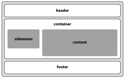
| float 방식 | - sidemenu는 float: left;하고, content는 float: right; - float의 해제(clear)가 필요함 |
<!DOCTYPE html>
<html lang="en">
<head>
    <meta charset="UTF-8">
    <title>2단 레이아웃 - float 방식</title>
    <style>
        #rin{min-width: 500px; padding: 10px; background-color: beige;
            border: 2px solid #000; border-radius: 10px;
            text-align: center; font-size: 18px; font-weight: bold;
        }
        .f-header{width: 100%; height: 50px; border-radius: 10px;
            line-height: 50px; background-color: lightblue;
        }
        .f-container{width: 100%; height: 200px; border-radius: 10px;
            margin: 10px auto; background-color: lightgreen;
        }
        .f-container p{ margin: 10px 0; padding: 5px; }
        .f-container:after{content: ""; display: block; clear: both;}
        .f-sidemenu{width: 30%; height: 100px; border-radius: 10px;
            margin-left: 20px; background-color: lightcoral;
            float: left;
        }
        .f-content{width: 60%; height: 140px; border-radius: 10px;
            margin-right: 20px; background-color: lightcoral;
            float: right;
        }
        .f-footer{width: 100%; height: 50px; border-radius: 10px;
            line-height: 50px; background-color: lightgray;
        }
    </style>
</head>
<body>
   <div id="rin">
        <header class="f-header">header</header>
        <section class="f-container">
            <p>container:after{content: ""; display: block; clear: both;}</p>
            <article class="f-sidemenu">sidemenu<br>float: left;</article>
            <article class="f-content">content<br>float: right;</article>
        </section>
        <footer class="f-footer">footer</footer>
    </div>
</body>
</html>container:after{content: ""; display: block; clear: both;}
float: left;
float: right;
| position - 절대, 상대 위치 |
- sidemenu는 position: absolute;하고, content는 position: relative; - 세로로 긴 쪽에 relative 해야 container가 포함할 수 있음 - 부모 박스를 지정해 주어야 함 |
<!DOCTYPE html>
<html lang="en">
<head>
    <meta charset="UTF-8">
    <title>2단 레이아웃 - position 절대, 상대위치</title>
    <style>
        #rin2{min-width: 500px; padding: 10px; background-color: beige;
            border: 2px solid #000; border-radius: 10px;
            text-align: center; font-size: 18px; font-weight: bold;
        }
        .p-header{width: 100%; height: 50px; border-radius: 10px;
            line-height: 50px; background-color: lightblue;
        }
        .p-container{width: 100%; height: 200px; border-radius: 10px;
            margin: 10px auto; background-color: lightgreen;
            position: relative;
        }
        .p-container p{ margin: 10px 0; padding: 5px; }
        .p-sidemenu{width: 30%; height: 100px; border-radius: 10px;
            margin-left: 20px; background-color: lightcoral;
            position: absolute;
        }
        .p-content{width: 60%; height: 140px; border-radius: 10px;
            margin-right: 20px; background-color: lightcoral;
            position: relative; left: 37%
        }
        .p-footer{width: 100%; height: 50px; border-radius: 10px;
            line-height: 50px; background-color: lightgray;
        }
    </style>
</head>
<body>
   <div id="rin2">
        <header class="p-header">header</header>
        <section class="p-container">
            <p>container position: relative; width: 100%; </p>
            <article class="p-sidemenu">sidemenu<br>position: absolute;</article>
            <article class="p-content">content<br>position: relative; left: sidemenu 너비</article>
        </section>
        <footer class="p-footer">footer</footer>
    </div>
</body>
</html>container position: relative; width: 100%;
position: absolute;
position: relative; left: sidemenu 너비
| position - 절대, 마진 방식 |
- sidemenu는 position: absolute;하고, content는 margin-left를 줌 - 부모 박스를 지정해 주어야 함 |
<!DOCTYPE html>
<html lang="en">
<head>
    <meta charset="UTF-8">
    <title>2단 레이아웃 - position-절대. 마진 방식</title>
    <style>
        #rin3{min-width: 500px; padding: 10px; background-color: beige;
            border: 2px solid #000; border-radius: 10px;
            text-align: center; font-size: 18px; font-weight: bold;
        }
        .p2-header{width: 100%; height: 50px; border-radius: 10px;
            line-height: 50px; background-color: lightblue;
        }
        .p2-container{width: 100%; height: 200px; border-radius: 10px;
            margin: 10px auto; background-color: lightgreen;
            position: relative;
        }
        .p2-container p{ margin: 10px 0; padding: 5px; }
        .p2-sidemenu{width: 30%; height: 100px; border-radius: 10px;
            margin-left: 20px; background-color: lightcoral;
            position: absolute;
        }
        .p2-content{width: 60%; height: 140px; border-radius: 10px;
            background-color: lightcoral;
            margin-left: 37%;
        }
        .p2-footer{width: 100%; height: 50px; border-radius: 10px;
            line-height: 50px; background-color: lightgray;
        }
    </style>
</head>
<body>
   <div id="rin3">
        <header class="p2-header">header</header>
        <section class="p2-container">
            <p>container position: relative; width: 100%; </p>
            <article class="p2-sidemenu">sidemenu<br>position: absolute;</article>
            <article class="p2-content">content<br>margin-left: sidemenu 너비</article>
        </section>
        <footer class="p2-footer">footer</footer>
    </div>
</body>
</html>container position: relative; width: 100%;
position: absolute;
margin-left: sidemenu 너비
| float + position | - sidemenu는 position: absolute;하고, content는 float: right; - float의 해제(clear)가 필요하고 부모 박스를 지정해 주어야 함 |
<!DOCTYPE html>
<html lang="en">
<head>
    <meta charset="UTF-8">
    <title>2단 레이아웃 - float+position 방식</title>
    <style>
        #rin4{min-width: 500px; padding: 10px; background-color: beige;
            border: 2px solid #000; border-radius: 10px;
            text-align: center; font-size: 18px; font-weight: bold;
        }
        .fp-header{width: 100%; height: 50px; border-radius: 10px;
            line-height: 50px; background-color: lightblue;
        }
        .fp-container{width: 100%; height: 200px; border-radius: 10px;
            margin: 10px auto; background-color: lightgreen;
            position: relative; float: left;
        }
        .fp-container p{ margin: 5px 0; padding: 5px; }
        .fp-sidemenu{width: 30%; height: 100px; border-radius: 10px;
            margin-left: 20px; background-color: lightcoral;
            position: absolute;
        }
        .fp-content{width: 60%; height: 140px; border-radius: 10px;
            margin-right: 20px;  background-color: lightcoral;
            float: right;
        }
        .fp-footer{width: 100%; height: 50px; border-radius: 10px;
            background-color: lightgray;
            clear: both;
        }
    </style>
</head>
<body>
   <div id="rin4">
        <header class="fp-header">header</header>
        <section class="fp-container">
            <p>container position: relative; float: left;</p>
            <article class="fp-sidemenu">sidemenu<br>position: absolute;</article>
            <article class="fp-content">content<br>float: right;</article>
        </section>
        <footer class="fp-footer">footer<br>clear:both</footer>
    </div>
</body>
</html>container position: relative; float: left;
position: absolute;
float: right;
< 3단 레이아웃을 완성시키는 방법 >

| float 방식 | - sidemenu와 content는 float: left;하고, banner만 float: right; - float의 해제(clear)가 필요함 |
<!DOCTYPE html>
<html lang="en">
<head>
    <meta charset="UTF-8">
    <title>3단 레이아웃 - float 방식</title>
    <style>
        #hye{min-width: 600px; padding: 10px; background-color: beige;
            border: 2px solid #000; border-radius: 10px;
            text-align: center; font-size: 18px; font-weight: bold;
        }
        .hf-header{width: 100%; height: 50px; border-radius: 10px;
            line-height: 50px; background-color: lightblue;
        }
        .hf-container{width: 100%; height: 200px; border-radius: 10px;
            margin: 10px auto; background-color: lightgreen;
        }
        .hf-container p{ margin: 10px 0; padding: 5px; }
        .hf-container:after{content: ""; display: block; clear: both;}
        .hf-sidemenu{width: 29%; height: 100px; border-radius: 10px;
            margin: 0 20px; background-color: lightcoral;
            float: left;
        }
        .hf-content{width: 29%; height: 140px; border-radius: 10px;
            background-color: lightcoral;
            float: left;
        }
        .hf-banner{width: 29%; height: 140px; border-radius: 10px;
            margin-right: 20px; background-color: lightcoral;
            float: right;
        }
        .hf-footer{width: 100%; height: 50px; border-radius: 10px;
            line-height: 50px; background-color: lightgray;
        }
    </style>
</head>
<body>
    <div id="hye">
        <header class="hf-header">header</header>
        <section class="hf-container">
            <p>container:after{content: ""; display: block; clear: both;}</p>
            <article class="hf-sidemenu">sidemenu<br>float: left;</article>
            <article class="hf-content">content<br>float: left;</article>
            <article class="hf-banner">banner<br>float: right;</article>
        </section>
        <footer class="hf-footer">footer</footer>
    </div>
</body>
</html>container:after{content: ""; display: block; clear: both;}
float: left;
float: left;
float: right;
| position - 절대, 상대 위치 |
- sidemenu와 banner는 position: absolute; - content는 position: relative; - 부모 박스를 지정해 주어야 함 |
<!DOCTYPE html>
<html lang="en">
<head>
    <meta charset="UTF-8">
    <title>3단 레이아웃 - position 절대, 상대 위치</title>
    <style>
        #hye2{min-width: 600px; padding: 10px; background-color: beige;
            border: 2px solid #000; border-radius: 10px;
            text-align: center; font-size: 18px; font-weight: bold;
        }
        .hp-header{width: 100%; height: 50px; border-radius: 10px;
            line-height: 50px; background-color: lightblue;
        }
        .hp-container{width: 100%; height: 200px; border-radius: 10px;
            margin: 10px auto; background-color: lightgreen;
            position: relative;
        }
        .hp-container p{ margin: 10px 0; padding: 5px; }
        .hp-sidemenu{width: 29%; height: 100px; border-radius: 10px;
            margin: 0 20px; background-color: lightcoral;
            position: absolute; left: 0; top: 20;
        }
        .hp-content{width: 29%; height: 140px; border-radius: 10px;
            background-color: lightcoral;
            position: relative; left: 35%;
        }
        .hp-banner{width: 29%; height: 140px; border-radius: 10px;
            margin: 43.5px 30px 0 20px; background-color: lightcoral;
            position: absolute; right: 0; top: 0;
        }
        .hp-footer{width: 100%; height: 50px; border-radius: 10px;
            line-height: 50px; background-color: lightgray;
        }
    </style>
</head>
<body>
   <div id="hye2">
        <header class="hp-header">header</header>
        <section class="hp-container">
            <p>container position: relative; width: 100%; </p>
            <article class="hp-sidemenu">sidemenu<br>position: absolute; left: 0</article>
            <article class="hp-content">content<br>position: relative; left: sidemenu 너비</article>
            <article class="hp-banner">banner<br>position: absolute; right: 0</article>
        </section>
        <footer class="hp-footer">footer</footer>
    </div>
</body>
</html>container position: relative; width: 100%;
position: absolute; left: 0
position: relative; left: sidemenu 너비
position: absolute; right: 0
| position - 절대, 마진 방식 |
- sidemenu와 banner는 position: absolute; - content는 margin-left - 부모 박스를 지정해 주어야 함 |
<!DOCTYPE html>
<html lang="en">
<head>
    <meta charset="UTF-8">
    <title>3단 레이아웃 - position 절대, 마진 방식</title>
    <style>
        #hye3{min-width: 600px; padding: 10px; background-color: beige;
            border: 2px solid #000; border-radius: 10px;
            text-align: center; font-size: 18px; font-weight: bold;
        }
        .hp2-header{width: 100%; height: 50px; border-radius: 10px;
            line-height: 50px; background-color: lightblue;
        }
        .hp2-container{width: 100%; height: 200px; border-radius: 10px;
            margin: 10px auto; background-color: lightgreen;
            position: relative;
        }
        .hp2-container p{ margin: 10px 0; padding: 5px; }
        .hp2-sidemenu{width: 29%; height: 100px; border-radius: 10px;
            margin: 0 20px; background-color: lightcoral;
            position: absolute;
        }
        .hp2-content{width: 29%; height: 140px; border-radius: 10px;
            margin: 0 20px; background-color: lightcoral;
            margin-left: 35%;
        }
        .hp2-banner{width: 29%; height: 140px; border-radius: 10px;
            margin: 43.5px 30px 0 20px; background-color: lightcoral;
            position: absolute; right: 0; top: 0;
        }
        .hp2-footer{width: 100%; height: 50px; border-radius: 10px;
            line-height: 50px; background-color: lightgray;
        }
    </style>
</head>
<body>
   <div id="hye3">
        <header class="hp2-header">header</header>
        <section class="hp2-container">
            <p>container position: relative; width: 100%; </p>
            <article class="hp2-sidemenu">sidemenu<br>position: absolute;</article>
            <article class="hp2-content">content<br>margin-left: sidemenu 너비</article>
            <article class="hp2-banner">banner<br>position: absolute; right: 0</article>
        </section>
        <footer class="hp2-footer">footer</footer>
    </div>
</body>
</html>container position: relative; width: 100%;
position: absolute;
margin-left: sidemenu 너비
position: absolute; right: 0
| float + position | - sidemenu는 float: left; 하고, banner는 float: right; - content는 position: absolute; (내용이 길면 부모 박스에 height 지정) - float의 해제(clear)가 필요하고 부모 박스를 지정해 주어야 함 |
<!DOCTYPE html>
<html lang="en">
<head>
    <meta charset="UTF-8">
    <title>3단 레이아웃 - float+position 방식</title>
    <style>
        #hye4{min-width: 600px; padding: 10px; background-color: beige;
            border: 2px solid #000; border-radius: 10px;
            text-align: center; font-size: 18px; font-weight: bold;
        }
        .hfp-header{width: 100%; height: 50px; border-radius: 10px;
            line-height: 50px; background-color: lightblue;
        }
        .hfp-container{width: 100%; height: 200px; border-radius: 10px;
            margin: 10px auto; background-color: lightgreen;
            position: relative; float: left;
        }
        .hfp-container p{ margin: 5px 0; padding: 5px; }
        .hfp-sidemenu{width: 29%; height: 100px; border-radius: 10px;
            margin: 0 20px; background-color: lightcoral;
            float: left;
        }
        .hfp-content{width: 29%; height: 140px; border-radius: 10px;
            margin: 0 20px; background-color: lightcoral;
            position: absolute; left: 32%;
        }
        .hfp-banner{width: 29%; height: 140px; border-radius: 10px;
            margin-right: 20px; background-color: lightcoral;
            float: right;
        }
        .hfp-footer{width: 100%; height: 50px; border-radius: 10px;
            background-color: lightgray;
            clear: both;
        }
    </style>
</head>
<body>
   <div id="hye4">
        <header class="hfp-header">header</header>
        <section class="hfp-container">
            <p>container position: relative; float: left; width: 100%;</p>
            <article class="hfp-sidemenu">sidemenu<br>float: left;</article>
            <article class="hfp-content">content<br>position: absolute;</article>
            <article class="hfp-banner">banner<br>float: right;</article>
        </section>
        <footer class="hfp-footer">footer<br>clear:both</footer>
    </div>
</body>
</html>container position: relative; float: left; width: 100%;
float: left;
position: absolute;
float: right;
'CSS' 카테고리의 다른 글
| CSS-레이아웃Ⅲ: Flex box Layout (플렉스 박스) (0) | 2020.08.29 |
|---|---|
| CSS-반응형 레이아웃 (미디어쿼리) (0) | 2020.08.27 |
| CSS-요소의 위치 정의 : position (0) | 2020.08.26 |
| CSS-레이아웃Ⅰ: float (0) | 2020.08.26 |
| CSS-요소의 정렬 : float (0) | 2020.08.26 |


댓글